
Rectangle Health:
healthcare payments made easy.
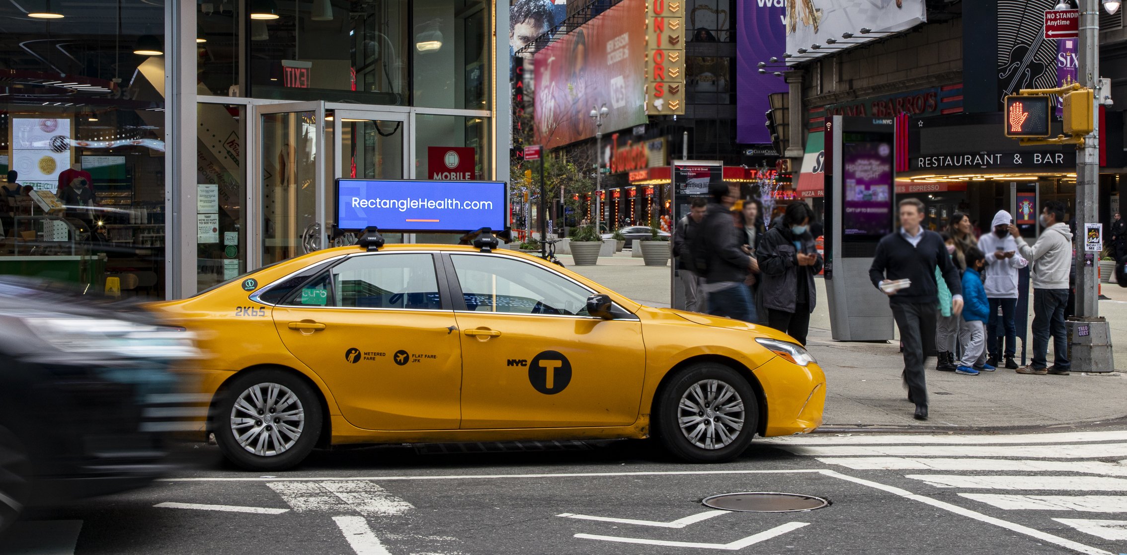
Rectangle Health makes innovative solutions for healthcare payments. In June 2021 company launched a promotional campaign in Times Square, NYC. In August 2021 I led the initiative in auditing existing assets and pivoting the campaign to focus on brand awareness.
Challenges:
Times Square is a unique advertising space
little chance to reach actual target audience
lack of visuals – no physical product to showcase
vague baseline message in the existing campaign

Ad sequence developed
Audit Step 1
Simplifying the message.
#1 One glance = one chance
Message needs to be as short and as simple as it can be.
#2 One message for the whole campaign
Because our chance to grab someone’s attention is so slim, we need to make a focused punch. Several messages, even if they deliver the same general idea, dilute the focus of the communication.
#3 One audience
There are no doctors and patients – there is one mixed audience in Times square and a secondary audience that has access to it through news feeds, selfies, blogs, streaming services etc. Let’s make the message simple enough to be understood on all levels.
#4 One feel
If this message is animated or supplemented with extensions (website, logo, etc), we need to ensure the feel of the message doesn’t change while the ad is playing. That it’s a smooth and simple slide transition.
Audit Step 2
Simplifying Design.
#1 No “band” / “box” design
Separating logo in a white box alienates it from the text under it. The logo needs to be united with the message.
#2 No repetition
Some slides in the old ads repeated the company name several times: logo + copy + website. Repetition adds unnecessary visual anchor points which take attention away from the message.
#3 No visual noise
Faded photos in the background create visual noise, making the text more difficult to read, “annoying” the reader – it’s not very obvious what’s in them. And they don’t add any meaning or value to the message.
#4 Be bold
Our CEO believes we’re the Apple of healthcare tech, so let’s be it – let’s put our logo first and make people remember it. We had an option to show the ad 4 times in 1 hour, we chose to run same simple ad all 4 times.

We made it stand out.
All current “neighbor ads” are based on visual. This gave us a privilege – we used a text-based ad and it allowed us to stand out among the photos, videos and animations of the Times Square screens. Vertically oriented motion also helps keep focus on the ad. The ad ran in Times Square September-November 2021 and was replaced by the Holiday ad in December.
Same concept – more applications

Times Square ad design concept served well for generalized brand awareness campaigns like geofencing for the New York Greater Dental conference in November-December 2021. Same simple message was formatted for a narrower audience of dental care specialists. Design remained the same.

Direct mail postcard
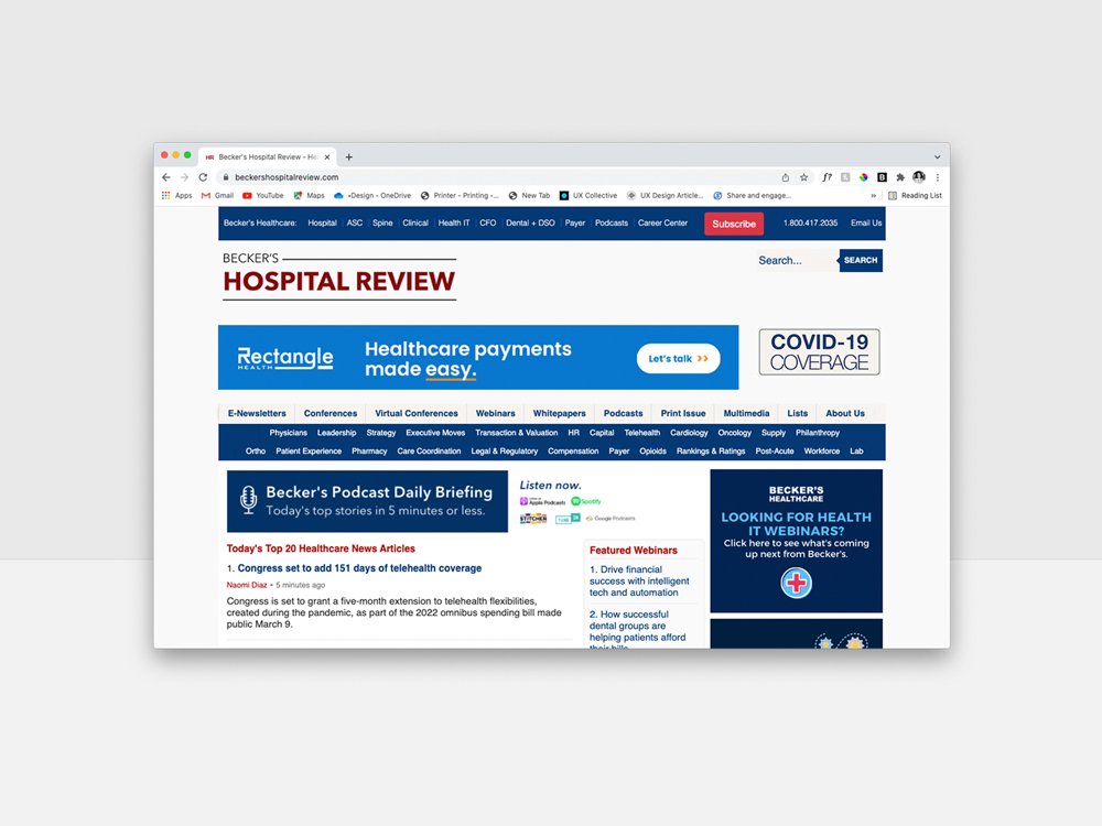
Banner ad on Becker’s Hospital Review website
Holiday Time Square ad
Art directed by me, animated by Zach Christy.